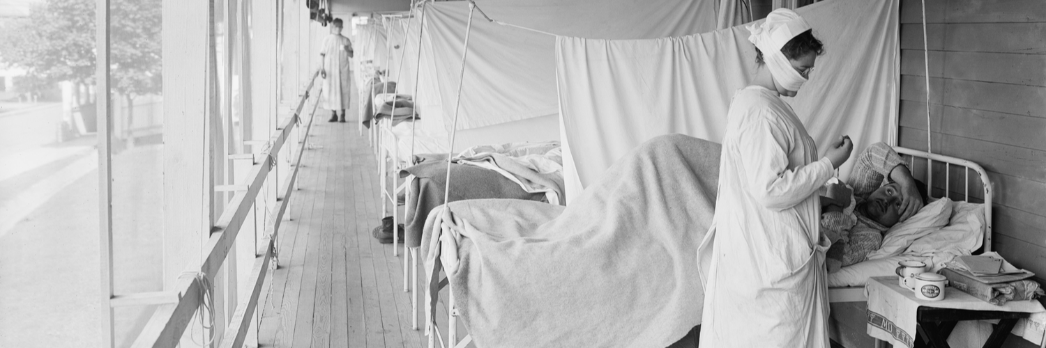
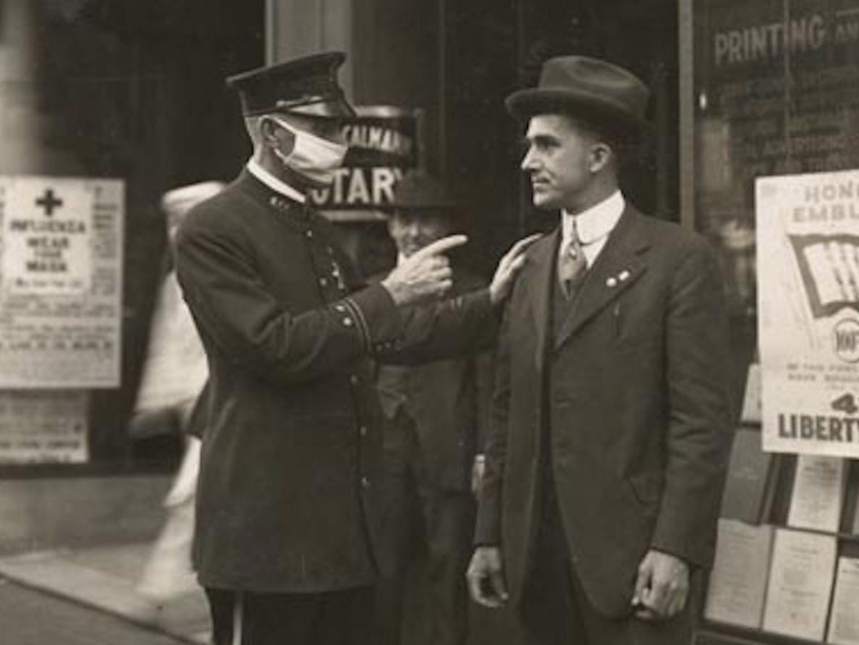
As we continue fighting the COVID-19 pandemic, mask orders, social distancing, school closures and mask naysayers have become commonplace. It’s a frequently quoted saying that history repeats itself, and unfortunately, it seems to be true recently. After all, those things were also common during the 1918 influenza pandemic.
In fact, I stumbled across some old photos and newspaper clippings from The San Francisco Chronicle during that time (Courtesy of the California History Room, California State Library, Sacramento, California). As you can see in the photos, there are some similarities to our current situation. The city first put mask ordinances in place in October 1918—during the second wave of the H1N1 pandemic. Later, they would rescind the order… and reinstate it again as cases spiked.
As I read more about the 1918 flu, I began to put together a timeline. This timeline showing the chronology of the 1918 pandemic is a valuable tool to explore what happened and when—and can act as an opportunity for us to learn from our last pandemic. After all, doesn’t some of that sound familiar? This spring, the Centers for Disease Control issued guidelines recommending the use of masks to help slow the spread of the deadly virus, and later, states, counties and local governments issued mandatory mask ordinances around the country as reported cases spiked. By creating this timeline, we’re able to see when cases spiked in relation to mask orders and large gatherings. Click here to see the full timeline.
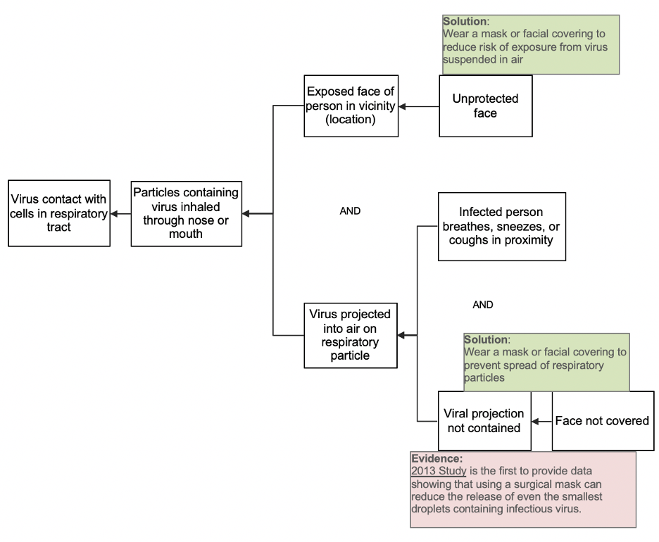
Whereas the timeline explains when an event occurred, a Cause Map™ diagram documents the cause-and-effect relationships within incidents—explaining why the event occurred. These two tools can be used together to better understand problems and find more effective solution options.
In one of his recent blogs, my colleague Aaron Cross used this method of root cause analysis to see how wearing a mask helps prevent infection of the novel coronavirus. As you can see, this became a risk mitigation strategy in 1918 and 2020. The most common routes of virus entry are through your nose and mouth. Airborne contact through your nose or mouth requires two causes: the virus must be suspended in the air AND your exposed face must be at the same location. As the causal relationships demonstrate, both causes are required. If you take away either one, you can’t have airborne contact and transmission. This fundamental relationship is important because it highlights two ways to reduce risk. By controlling either cause, you can reduce the risk of becoming infected by the deadly virus. An obvious solution here is to avoid public locations as much as possible. And, if you must go out in public, consider protecting yourself from airborne contact by covering your mouth and nose.
In the below graphic, we see this visual representation of the cause-and-effect relationships involved in this viral contact. To read it, start on the left side and ask Why? So, in this instance, "Virus contact with cells in the respiratory tract." Why? Because the virus made contact with cells in the respiratory tract. We can continue reading from left to right following this pattern.

To see the larger Cause Map diagram, see Aaron’s full blog mentioned above. For more information on Cause Mapping® root cause analysis, consider one of our upcoming online training options.


