
One question I frequently get asked is "How do I know if I should do a failure modes and effects analysis (FMEA) or a root cause analysis (RCA)?"
The answer is simple: are you trying to find out what DID happen or what COULD happen?
Typically, root cause analysis is used to diagnose an event that has already occurred. The term is often synonymous with an accident investigation or failure analysis. RCA takes place after the incident to determine what went wrong. It is considered reactive.
FMEA, on the other hand, is proactive and conducted before the problem happens. An FMEA is a systematic approach to anticipate and evaluate events that could happen. Its primary objective is to identify potential failure modes (i.e., the way that something can fail) and their impacts so that preventive measures can be implemented to minimize the overall risk associated with a process, product, or service.
FMEA Origin and Evolution
FMEA was developed by the U.S. military in the 1940s. Today, it serves as a critical tool in safety and reliability engineering across virtually every industry – from determining the airworthiness of planes, to achieving clinically desirable outcomes in healthcare. In process applications, such as chemical and refining plants, the fundamentals of FMEA are part of Process Hazard Analysis (PHA). Reliability-centered Maintenance (RCM), which defines risk-based operations and maintenance activities is also based on FMEA.
There is sometimes a misconception that FMEA only applies to engineered systems, such as equipment, mechanisms, or assemblies. However, the basis for an FMEA is simple cause-and-effect. Thus, it can be applied to any system or process where it’s important to understand what events could prevent the desired outcome from being realized.
The FMEA Table
The FMEA table provides a structure for ranking the failure modes in a system. In the first column of the table, subsystems and components are listed on their own row. This initial list can be basic with 5-10 items. Depending on the complexity, more detail may need to be added to accurately reflect the system. People in your organization familiar with the system will be able to explain specific aspects of its operation and what level of detail is needed.
The second column lists the different ways in which each item can lose function. Each of these failure modes gets its own row. A single item in the first column may have a few different failure modes. The potential effects (the negative outcomes) are listed in the third column. There are additional columns for capturing the causes of the failure modes and what is currently in place to prevent and control each failure mode. This is an example FMEA worksheet in Microsoft Excel that we give out during our FMEA 101 online short course.
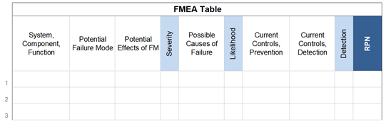
Ranking the Failure Modes
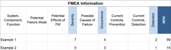
The risk priority number (RPN) ranks the failure modes. Each failure mode is assigned three numbers on a scale of 1-10. It’s also acceptable to begin with a simpler ranking of “low-medium-high” using numbers from 1-3 or even 1-5.
The first number represents the severity of the effect if that failure mode were to occur. The second number is the likelihood of that failure mode occurring. For both severity and likelihood, 1 is the lowest severity, 10 is the highest. The third number is the ability to detect that failure mode if it does occur. The detection number is higher if the failure mode is difficult to recognize since it would make the risk higher. The number is lower if it is easy to detect.
Ideally, an organization would have operating or experiment data for these rankings. If not, people can make a relative estimate of the number, but it’s more subjective. Involving people with firsthand experience of the system is critical to ensure that every bit of relevant information is captured and documented. In the case of a process plant, for example, this could mean the operators, maintenance technicians, engineers, original equipment manufacturers (OEMs) and even their suppliers.
Once all three numbers are written down, they’re multiplied together to get the RPN which is a number between 1-1,000 (10 x 10 x 10 is the worst-case scenario). This one number is the relative risk for each of the failure modes in the table. The table is re-sorted with the highest risk failure modes at the top and the lowest at the bottom. This sorted FMEA table defines your organization’s priorities for mitigating risk in this system.
Risk Reduction Plan
All failure modes don’t need to be addressed right away since some will be lower risk. The initial plan may be to mitigate only some of the higher risks at the top. An organization may draw a horizontal line on the table where only failure modes above that threshold level will be addressed.
A specific action plan is defined to lower the risk of each failure mode. This is done by either reducing the severity of the consequences, lowering the likelihood of it occurring, or changing the ability to detect it. The action plan can pull from industry standards and best practices, as well as creative ideas from those within the organization.
These types of solutions are around us every day.
Airbags, for example, don’t prevent car accidents, but they can significantly reduce the severity of injuries. A second look at your grocery list before the register can significantly reduce the likelihood of forgetting something at the store. That simple double-check is a normal part of every commercial flight you’ve been on. And a smoke detector doesn’t prevent a house fire from starting, but it provides an early warning to those inside even if they’re asleep.
Update the Table…and Keep It
After solutions are put in place their effectiveness needs to be measured. In other words, did the specific actions reduce the risk of that failure mode occurring? If the numbers for severity, likelihood and detection are lower, then the answer is “yes."
The table can be updated to get the RPN for the failure modes that were addressed. If the RPN was lowered sufficiently, then the objectives for that initiative may have been met. Some organizations may select a new lower RPN threshold and begin the cycle again.
The level of effort for this type of exercise is ultimately based on what your organization considers an acceptable level of risk (i.e., reliability).
Airlines with 4,000 flights a day or a children’s hospital that delivers 4,000 doses of medication daily will have a different risk tolerance and operating mode than other organizations. Acceptable levels of risk vary across industry and organization as do the approaches to problem solving and prevention.
If a system is to be a planned part of the operations for years, then the FMEA can be updated over the life of the system. People may come and go, but specific failure modes can remain the same. Effective solutions should stay in place too. Sometimes a turnover in personnel produces unwanted changes in operations. Maintaining this information provides continuity to the organization.
Layout the FMEA Visually in Microsoft Excel
A table is the best way to organize failure modes, effects, and causes to calculate the RPN. It makes it easy to list the systems and subsystems, identify failure modes along with their effects and causes. It’s also simple to calculate and periodically update the risk priority number.
A program like Microsoft Excel works well for documenting the entire FMEA in a spreadsheet. Each worksheet is already organized as a table and sorting by the RPN number is already a function within Excel under data > sorting.
Traditional FMEA defines failure mode, effect, and cause as distinctly different terms, which provides a clear framework for each of the failure modes. Because FMEA is based on cause-and-effect, every relationship in the table can be connected visually into one larger diagram.
Clients who use our Cause Mapping® method for root cause analysis create Cumulative Cause Map™ diagrams to capture the different failure modes they’ve identified over the operational life of those systems and equipment. The diagram complements the FMEA table to show how all the parts fit together. Check out our How are FMEA and RCA connected? blog post to download and walk through an example of a Cumulative Cause Map™ using printer failures
All the information can be organized in one Excel file. Below is an example FMEA for a conveyor system. There is a separate worksheet for the overall diagram of the conveyor system (Fig 1.), the FMEA table for the conveyor system (Fig 2.), and the Cumulative Cause Map™ diagram for the conveyor showing all the cause-and-effect relationships together (Fig. 3.).
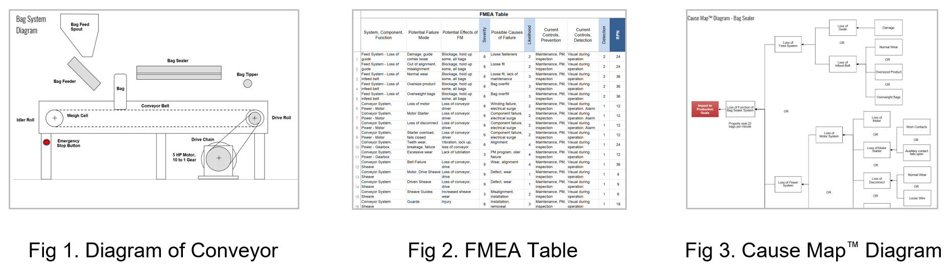
Three different worksheets are all in one Excel workbook.
If you would like to learn more about FMEA and how you would be able to apply it to your organization, check out our FMEA 101 online short course.

To learn more about improving the way your organization analyzes, communicates, documents and solves problems visit our website, attend one of our free webinars or register for one of our online short courses, on-demand courses or workshops.


