
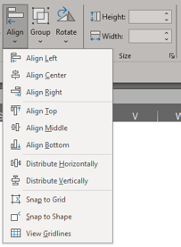
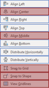
Excel offers a total of 11 functions in the alignment group, but for Cause Mapping® root cause analysis, we focus on six key functions: left, right, top, bottom, distribute horizontally and distribute vertically. These are found under the shape format tab which only shows when an object is selected.
Let’s look at how we use these six functions using a simple Cause Map™ diagram as an example.
Align Left:
-1.png?width=750&height=200&name=Left%20Align%20(1)-1.png)
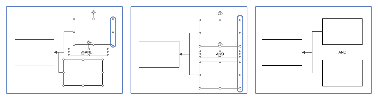
In the example above, I selected three objects: two cause boxes and the AND statement. If I navigate in the Excel Ribbon to Shape Format > Align, and then select Align Left from the menu drop-down, the three objects will snap to the leftmost point, currently highlighted in blue for demonstration purposes.
Align Right:
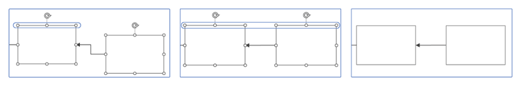
You might be able to guess what happens when clicking Align Right from the drop-down. It’s the same functionality as align left, but the alignment is done according to the rightmost object (highlighted in blue).
Align Top or Bottom:
You might be sensing a trend, but it’s the same functionality as left and right. Top and Bottom alignment is based on the highest or lowest point, respectively, of a set of objects.
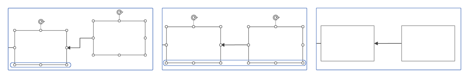
Distribute Horizontally:
This feature works a little differently than the previous four but is still just as important.
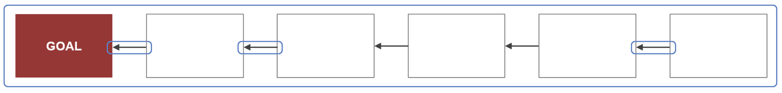
In the example below, I have a 5-why where the spacing between boxes is all over the place. I don’t know about you, but this makes me twitchy.
To make the spacing equal between each of the boxes, I select all the boxes, navigate in the Excel Ribbon to Shape Format > Align, and then select Distribute Horizontal from the drop-down.
Note: Ensure that only boxes are selected. If both boxes and arrows are selected at the same time as distributing horizontally, the arrows will disconnect from your boxes.
What this will do is anchor the objects using the far left and far right bounds, and then distribute the spacing between all the other selected objects equally, so that they’re the same distance apart.
.png?width=2500&height=300&name=Distribute%20Horizontally%204%20(1).png)
Next, I can make the height of my arrows zero so that it is a straight line going through – see the time we talked about managing your arrows.
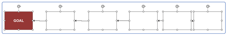
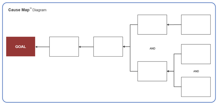
Distribute Vertically:
This is very similar to distribute horizontally, but it applies vertically (surprise!). I like to use this to make sure my AND text boxes are evenly spaced in the middle of the two cause boxes they’re joining.
In the below case, I have two sets of AND boxes that I want spaced evenly.
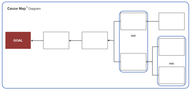
I’ll start with the left set, highlight the two cause boxes plus the AND text box, and select distribute vertically.
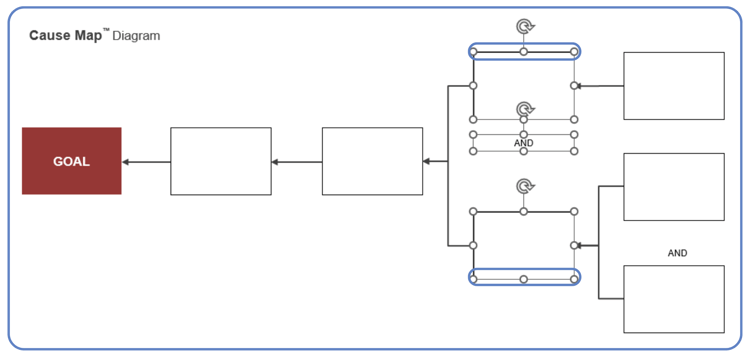
It spaces the AND perfectly in the middle of the boxes.
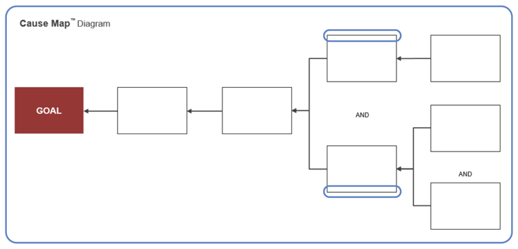
Next, I’ll do the right side of the diagram above.

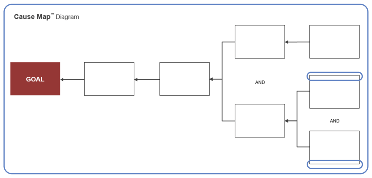
Performing that twice gives us evenly distributed AND boxes within the causes and cleans up our map.
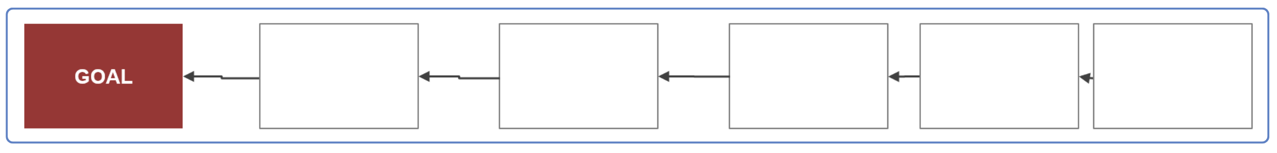
These functions are helpful to master to be quick and efficient in Cause Mapping RCA using our root cause analysis template in Excel.


