I often get questions from people who have a hard time making their Cause Map™ diagrams look as polished and well put together as the Cause Map diagrams our investigation engineers and instructors build. Our finishing touches are not complicated, but if you don’t know this sequence of six steps, it can be time-consuming to clean up your maps:
- Assess the map
- Connect all the arrows
- Standardize the box properties
- Adjust the spacing
- Make new paths symmetrical
- Straighten the arrows
I recently helped an individual who reached out to resolve issues with his Cause Map diagram. While I've omitted the specific causes and solutions resulting in the Cause Map diagram below for confidentiality reasons, I'd like to take this opportunity to guide you through the order of the steps I follow for every map that I build or review. My goal is to help you efficiently create professional presentations from your Cause Map investigation files.

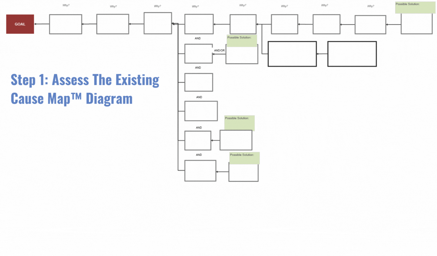
Step 1: Assess the Existing Cause Map™ Diagram
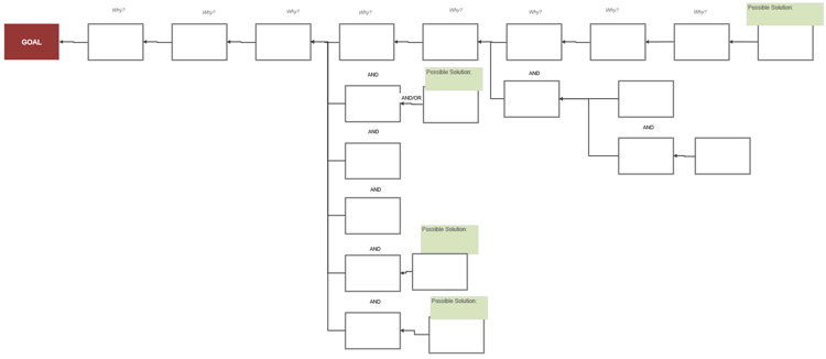
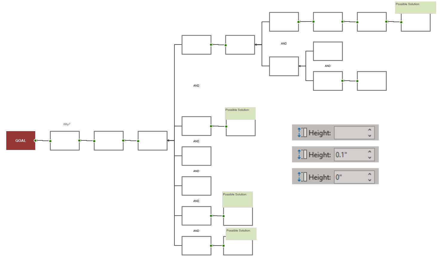
A few things immediately pop out to me when assessing this example:
- Some arrow connectors don’t seem to be behaving as desired. There are arrows with kinks and others aren’t completely connected to each box.
- Our boxes vary in size.
- The space between the boxes is not uniform.
.png?width=1732&height=749&name=Assess%20the%20Cause%20Map%20(2).png)
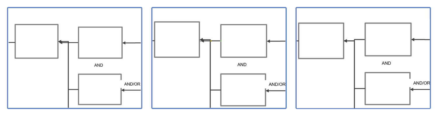
Step 2: Connect all of the Arrows to Their Corresponding Cause Boxes
While you’re in the middle of collecting information and adding cause boxes to your Cause Map diagram, sometimes making sure those arrows are fully connected gets missed. If you know to watch for this issue while you're building, it makes cleanup a breeze. This post on merging your arrows in Microsoft Excel explains how to tell if your arrows are connecting on both ends.
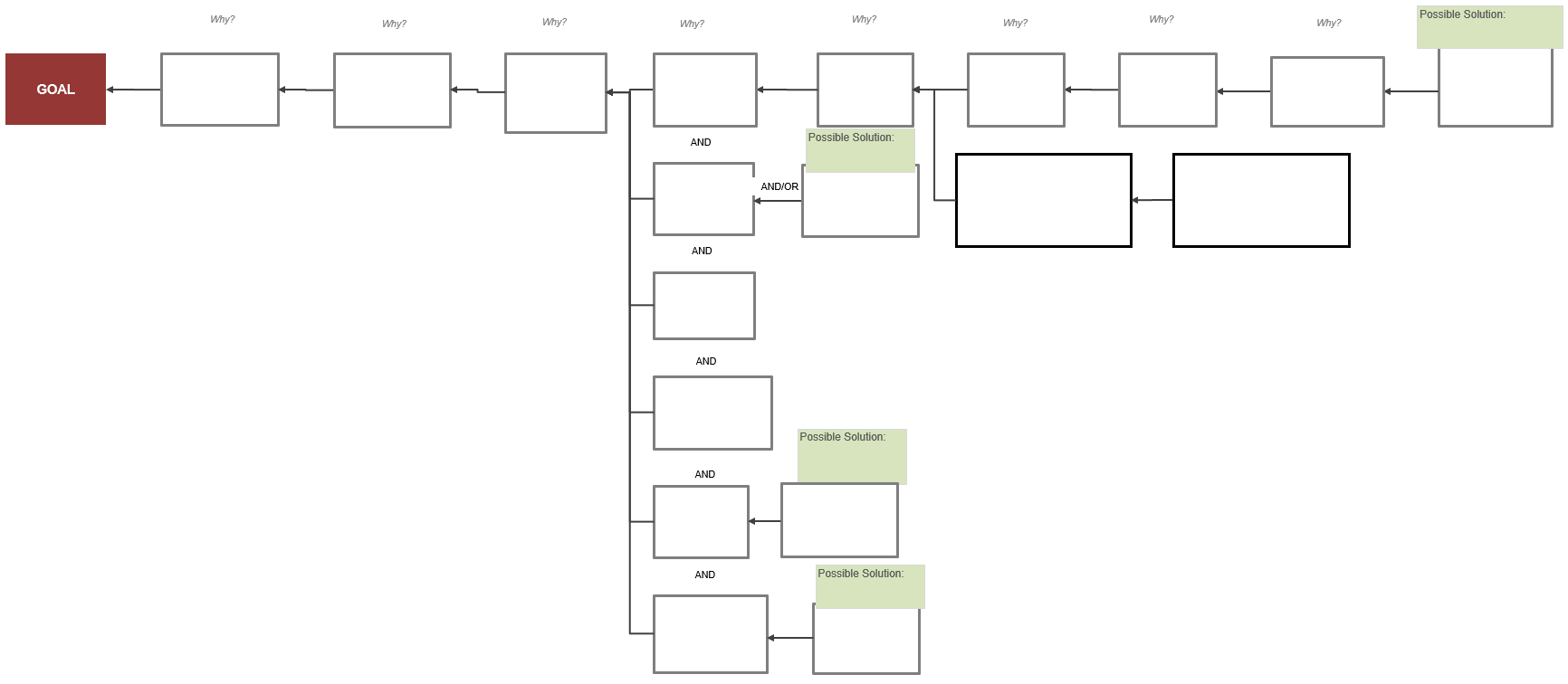
Step 3: Standardize Cause Box Properties
In this incident, the person was trying to be specific, which caused them to have a lot of words they wanted to put in the box. Typically, this is an indication that you have some additional causes nested into the cause you are trying to write. When you see words like "and" and "because" inside a cause box, consider splitting those out to show accurate causal relationships.
Wordy cause boxes increase the risk of establishing invalid causal relationships. We will go more in-depth on this in a different blog but if someone sends you a Cause Map diagram or you are preparing your diagram for a final report, it is always recommended to validate the cause-and-effect relationships before you start going through the process of tidying the design.
.png?width=750&height=400&name=Splitting%20Cause%20Boxes%20(1).png)
I prefer that each box on my Cause Map diagrams have 0.8 height, 1.2 width and a gray outline but this comes down to personal preference. Whatever your desired size and color are, select all of your boxes and update their properties.
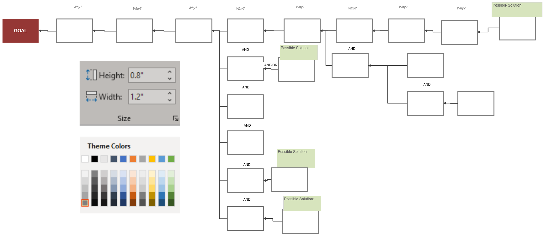
Step 4: Standardize Spacing Between Cause Boxes
Distribute and adjust rows:
I like my Cause Map diagrams to have a 0.5 spacing between the boxes. While there isn’t a way to get the boxes to space this way automatically, it’s not difficult to do manually.
.png?width=750&height=325&name=Distribute%20Horizontally%20(1).png)
In the screenshot above, you'll see that I select the top row of cause boxes only (don’t select the arrows between them) and then once the boxes are highlighted, in my Excel ribbon, I go to Shape Format -> Align -> Distribute Horizontally. This is also a good time to align the rows using Align Top or Align Bottom found in the same location.
Align and adjust columns:
.png?width=750&height=325&name=Align%20the%20columns%20(1).png)
Once I have the top row evenly distributed, I can align the columns of causes to the top row by using Align Left or Align Right. I also use Distribute Vertically to ensure that the ANDs are evenly spaced between their cause boxes.
Step 5: Make Parallel Paths Symmetrical
If you remember from any Cause Mapping training you have attended, a parallel path is where you change from 1 effect <- 1 cause (straight line) to 1 effect <- 2+ causes (multiple connected lines). When people start adding parallel paths, we often see them maintain the full straight line and add a new connected line of causes underneath.
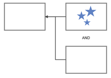
This leads anyone looking at the Cause Map diagram to assume that the top path is more important than the path(s) below it. At ThinkReliability, we recommend ensuring that your parallel paths are symmetrical.
What do I mean by symmetrical? Effects should be in the center of all of their paths. This not only looks good but allows people to see that both/all of the causes were required to produce that effect.
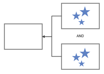
When reviewing a Cause Map diagram, I find working from the right to the left of the map to be the most efficient method to ensure it conveys that all causes are important.
.gif?width=750&height=439&name=Symmetrical%20Map%20(1).gif)
Step 6: Straighten out the Arrows
Like we have discussed before, after the map is completely built, I like to make the arrows straight.
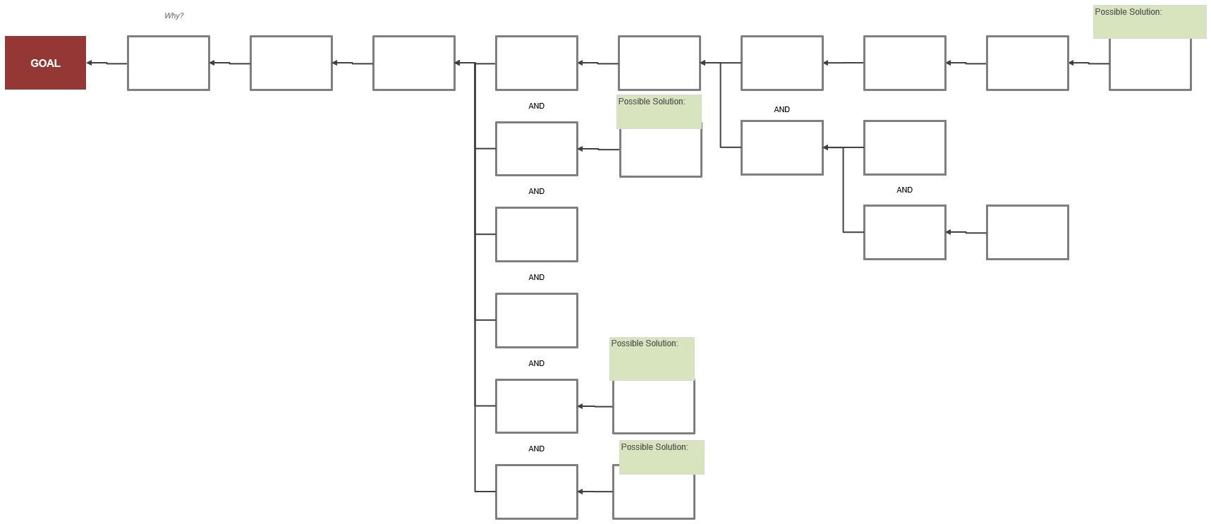
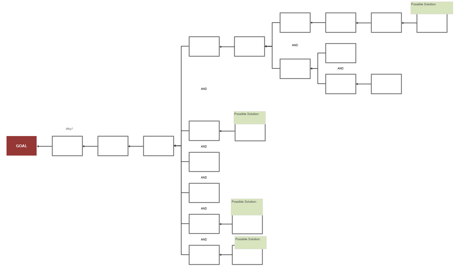
After following these steps, we now have a cleaner Cause Map diagram. Without changing much of the language in the cause-and-effect boxes we’ve made the map easier to understand and read.
After a little practice, cleaning up diagrams isn’t typically a time-consuming process. Cleaning up the map in this example took me three minutes. A couple of tweaks to how you build throughout the process can make your final maps look clean and professional.